


Lettering and Panel Borders in Illustrator (Post 2 of 2)
[NOTE: I’VE SINCE DONE A FULL VIDEO TUTORIAL ON THIS SUBJECT THAT EXPLAINS IT A LOT BETTER THAN THIS! CHECK IT OUT HERE.]
[See yesterday’s post for the first half]
![]()
Okay, here’s some more info on my idiosyncratic method for lettering and panel borders. With luck, I hope to make this post obsolete soon by creating a proper video tutorial. But first… gotta finish what I began.
—
Part 4: Panel Borders
Now might be a good time to mention that, as in yesterday’s balloon explanation, this is how panel borders are made the first time you make them. After that, you’ll want to create a template. I’ll show you my template at the end but everyone’s template is different.
Basically my panel borders use that same stroked-content appearance that the word balloons use. The key is create a new layer set above the balloons and text, with its own stroked appearance so that it overlaps the balloons.
The result should look exactly like a white wall with windows cut out of it that the balloons (and eventually, the artwork) can appear behind.
1. Same document as last time.
2. Create a new layer, name it “Borders.”
3. Select the rectangle tool from the tools palette
4. Set its color to white, no stroke.
5. Create the outer box for your page. I’m just doing a sloppy job in the video—proof of concept only. You’ll want your eventual template to be to specific measurements of course. (see Part 5).
6. Again, repeat the stroked appearance technique from Part 1, steps 7-9.
7. Draw in the panel gutters, as if they were window sashes. If you’re like most of us, you’ll want all the gutters to be consistent sizes, so you can just drag and copy (personally, I make my horizontals a bit thicker, but everyone has their own preference).
8. Lock the “Borders” layer when you’re done.
9. Select the balloon and drag it around to see the window effect. (VIDEO)
10. Play Words with Friends for a while, argue about Game of Thrones on Facebook—Hey, get back here!
—
Part 5: The Template
So, everybody’s template will be different, but if it helps, here’s some info on mine.
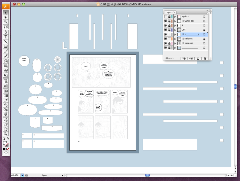
Open this Screenshot of my Template in a new window and read the below info alongside it.
You’re looking at a file in Illustrator that’s ready to be exported to Photoshop so that I can start drawing. (Technically, I’ll be exporting a copy of this file that has all that crap around the margins deleted, but this way, I can explain the crap).
At left, you’ll see some useful balloon and caption shapes and various tails (arranged in odd-looking circles so I’ll have any angle I might want). The text boxes are already placed in their balloons, with a single “x” in each that I can select to begin typing.
At top and on right are the panel gutters. The fat ones are for the space around the panels, the thin ones for the regular gutters. I have a lot of bleeds in this book, otherwise, I’d just put the fat ones in place in the template and leave them there.
I have a standard grid that I’m using (2, 3, or 4 tiers, depending on the page, and regular divisions width-wise), so the regular gutters are positioned to copy-drag in.
At top, toward the left, you’ll see a big letter “L.” Since this is for print, there’s a slight difference in layout between Right and Left pages. This is the Left template. I don’t wanna mix them up! They look pretty similar.
My layers have odd names—for reasons I’m not even sure I can explain, except to say that it helps me spot them at a glance. Here’s a bit on each.
The bottom layer (cleverly named “____________”) is just a blue background to help me see the balloon and gutter widgets more easily. Also I like blue. Notice that it’s locked. Really good idea to lock whatever you’re not using.
Next layer is “||| <rough>.” Why the vertical lines? Fucked if I can remember! I’m sure I had a good reason at the time. The art is a rough layout, not finished art. I’ve placed a copy of that rough in the layer and, using the little pop-up menu in the layers palette, set the options for the layer so that placed images like this one are nice and dim.
The balloon and lettering layers are next. If you like, you might want to have two or even three balloon layers so that balloons from different characters can overlap without joining together.
“GUT” is gutters of course. Did I mention that all of these layers will be renamed in Photoshop?
“#” is the page number. The page number needs to sit OVER the gutters, since it’s not in one of the panel windows. Ditto for other overlapping elements.
The “Outer Box” layer marks the extra border area that will be trimmed away in Photoshop (that dark blue box around the page). Helps isolate it visually for me, though it’s not strictly necessary. It’s… I dunno… I like it… It’s blue.
The “<grid>” layer is just a red line guide to help me place the layout and other elements. Not visible in this screenshot (notice the absent eye icon in the layers palette?). I don’t have to bother deleting it because I set its options (in the layer palette’s pop-up menu) to not “print,” which also means it doesn’t export.
—
I’ve found lettering this way incredibly easy and pretty fast. I open the template, drop a layout page in, drag in the balloons, type in the text, throw on the tails, tweak it a bit, and I’m done.
I export a duplicate of the file (with all the extra stuff deleted) to Photoshop at 1200 dpi grayscale, keeping the text editable.
Then in Photoshop, I hit a button in the Actions palette* and it renames and rearranges all the layers (and adds quite a few new ones) in a matter of seconds.
The resulting file is ready to draw in. AND, if I need to make a change in the lettering later, I can do so right in Photoshop, since the lettering itself is still editable.
That’s it for now. Hope this is useful to someone!
Next: I’ve found a program I like for better screen recordings with voice. If I get time, I’m going to try to create a more sophisticated video tutorial, so we won’t need this clunky thing anymore.
—
[*One tip on recording layer changes in Actions: All layer names should be unique, and if you create a new layer while recording, be sure to rename it immediately; one document’s new “Layer 7” may be another document’s new “Layer 12”]
Oh! And one last unrelated, but important note: Sky has decided. Santa Cruz it is!
Great, I’ll definitely use this. But how would one go about doing bleeding panels that overlap/go under other panels?
Good question!
I tend to just approximate such panels in Illustrator and tweak in Photoshop, but one could also use the line tool to make the segments manually. Not as elegant, of course, but wouldn’t take too long.
Great, thanks Scott!
Awesome stuff Scott, thanks for these two posts! 8)
Great Stuff. I already did my template based on these posts.
hey scott, thanks for posting up these tutorials, very helpful and thorough, though definitely leaning towards a certain style of speech panels. Very helpful!
[…] Scott McCloud’s Very Narrow Tutorial on Lettering (Source: Scott McCloud – Part 1, Part 2) […]
[…] Part 2 – Borders and Templates […]
-But how would one go about doing bleeding panels that overlap/go under other panels?-
simply.. by creating each panel in separate layers and putting your layers in the order of the panel you want to appear on the top (1 layer top panel 2nd layer overlapped panel etc..)