


My First Video Tutorial!
As promised, I’ve just released a real video tutorial covering last week’s lettering tips in two parts: Part One | Part Two. (Be sure to select “720p HD” for the clearest view.)
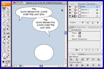
I know it’s just a silly How-To, but I’m actually kind of excited to finally be able to explain this system that I’ve enjoyed using for so many years. I really think this is a faster, more enjoyable, and more flexible system than most methods I’ve seen and would love for others to give it a try.
The appearance layer trick has been incredibly useful for me, but it was always hard to explain. Now I can simply give people a link, and show them why I like it so much.
Thanks to “Craniumation” in last week’s comments section who suggested the program Screenflow to capture my desktop demo.
I’m off to Atlanta today for a private Turner event on Tuesday, then off to NYC via JFK for SVA on THU. Blogging might be spotty, but have a great week!
This is just terrific! I really love tutorials with video, because seeing how something works real-time with the description is always nicer than just reading it/since I’ll inevitably find some way to mess things up. Thanks, Scott! Can’t wait to try this out.
Also, I thought I should mention that turning on the closed captions for the first part makes this tutorial unintentionally quite funny. Despite your excellent annunciation, YouTube seems to really struggle in bits. #maturity
Really nice work, Scott. A number of people had recommended taping the audio after creating the video. But it looked to me like you wound up doing both at the same time. That made for real immediacy when you corrected yourself at one point—the mouse doubled back at the same time as your words did.
Thanks for the informative tutorials. As someone who recently stumbled into the comic lettering profession and has learned most of his techniques through trial and error your videos were really eye-opening. I definitely anticipate saving a lot of time with your stroke-behind-the-content and template layout methods on future projects.
An alternate approach to create balloons/tails that I’ve recently adopted is to just select the pencil tool in Illustrator and draw the shapes using your tablet. Any path fine-tuning can then usually be taken care of with the warp tool set to a low intensity. Obviously this method is going to provide a rougher, more organic look than the traditional ellipse/pen approach but it is faster and, I think, can be a good fit for certain types of comics.
I -think- this is the same method you showed me in the studio a couple of years ago. I remember your being so excited about it and how cool it was. It’s great to see it again, and to be able to re-watch it if necessary. (It was also fun to see that very brief appearance by Ivy on your desktop!) The one thing I’d mention is what happens between parts one and two. I’m guessing you make a pair of ‘blanks,’ files you open that make up your template and that, once you have finished the Illustrator part of things, you do a ‘save as,’ leaving the original ‘blank’ alone. Or is there another method for this? And thanks for that little preview of the comic, as brief as it was at the end!
I suspect Scott imports his template file into the new page file, thus eliminating the danger of overwriting the original template. I’d test it out right now, but my Illustrator program is teh borked, and I keep procrastinating on reinstalling.
Any Mac document can be made marked as a “Stationary Pad” which means that any time you click to open the file, it’ll open a copy of itself and leave the original untouched. Perfect for templates.
To make a file into a stationery pad, select the file icon and pick “Get Info” from the file menu. You’ll see the checkbox for that and a bunch of other useful features.
Does this “stationary pad” concept work in Photoshop or Paintshop Pro Windows versions? I’m going to upgrade my graphics package this year and this would be an excellent tool to have.
It’s a Mac thing. No idea if Windows has an equivalent feature. They might.
See? There was no reason to apologise for not posting everyday- especially if you compose a great post like this one after a few days of silence. Anticipation is a very good seasoning.
Thanks Scott, very useful!
It’s very nice to get a view on the desktop of a pro. There’s a ton of how-to’s online but so many are poorly done. This one is great. Bonus for the calm voice-over without any background noise.
You might want to type the text first, position and lock it, and then draw the balloon to match it, in a layer below it, instead of the other way around. Often, you don’t know exactly how much room a text needs before typing it, or how it will ‘roll’ in a certain form of balloon.
In part 2, photoshop, move tool, you can opt for ‘auto select’ layer, so you don’t have to click through groups of layers to select one. Even better: With the type tool, clicking a text selects the text layer automatically.
I showed this to my comics-making partners, and I’m afraid they recoiled, shaking their heads. To paraphrase what they said to me:
“This is a good tutorial for Adobe, but Manga Studio EX is a much better program. You’re making things very complicated for yourself. It is true that the Mac version isn’t as good at resizing type so you’re better off using style sheets for that. But even with that limitation, it greatly cuts down the amount of time you need to spend, and allows you to redesign and redraw as you letter.”
YMMV, of course, but I’d urge you to look into this if you haven’t yet.
I’d be happy to see a comparable video demo of MS EX doing word balloons. If there’s another way to get those balloon/tail shapes, those kinds of fitted text boxes, unified strokes on the fly, and varying type sizes between and inside balloons, I’d be happy to pass it along.
Again, though, for anyone thinking this looks complicated, I should stress that 80% of the steps these videos cover only had to be done once. My actual daily process of lettering is a breeze now (especially when I don’t have to talk through it. 😉
Enjoy SVA. I really learned a lot from continuing ed there.
Why are Macs so prized for this kind of work? I think I might have known sometime before, but I don’t really know why now…
I LOVE both my laptop and desktop Macs, they almost never have any problems and are beautifully designed, inside and out.
That said, I haven’t had call to use a Windows PC in years, so maybe they’re wonderful now. I know a few cartoonists who prefer them.
Was that a page from your new graphic novel I saw in Part Two?
Yup! Though I plan to design a new font for this book as well, so that one is just a placeholder.
[…] [NOTE: I'VE SINCE DONE A FULL VIDEO TUTORIAL ON THIS SUBJECT THAT EXPLAINS IT A LOT BETTER THAN THIS! CHECK IT OUT HERE.] […]
[…] [NOTE: I'VE SINCE DONE A FULL VIDEO TUTORIAL ON THIS SUBJECT THAT EXPLAINS IT A LOT BETTER THAN THIS! CHECK IT OUT HERE.] […]
Awesome!!! I’m a huge fan of Illustrator, and I try to use it whenever possible!!
For what it’s worth… I use PCs/Macs about 50/50. For my use (which would be drawing and illustration), they’re about the same. 🙂
That appearance tip MADE MY DAY!!!
Thanks for this great tutorial. Just wondering what size the document should be for a standard (printed) comics page? A one pixel stroke around the balloons seems too small when I do it (looks fine in the video though)?
Once in Photoshop, I work at 1200 dpi which is pretty high. Most could get away with 1000 for linework or even a bit less. Less still for color and tone.
And yeah, a 1 point stroke (“point” not “pixel” but I’ll bet you knew that) in Illustrator is pretty thin for most people (doesn’t look that thin in the first video ’cause I’m showing just a small part of the desktop).
Illustrator asks to specify a resolution at the outset IIRC, that might also affect what “1 pt” means in terms of pixel distance.
Personally, I like my borders thin (thanks, Mr. Tufte), but I think most would choose a little more weight.
Thanks for the quick reply! And yes, I meant point, not pixel. D’oh!
it would be nice if you could share your template(espacially the tails!!)so we can dounload it!!!!lol!! thanks anyway for your tutorials,really eye opening!