webcomics
print
inventions
presentations
consulting

Archive for ‘Visual Communication’


Is There Anyone Who Hasn’t Seen This?


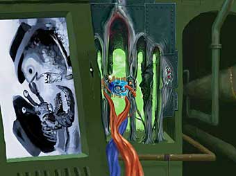
Kseniya Simonova’s remarkable sand painting video has been viewed by eight million people, so I’m guessing a lot of you have already seen it, but just in case, here it is one more time.

There’s this weird thing that happens where if enough people recommend a link to me, I figure I don’t need to blog about it, because everyone has already seen it. Still, eight million out of six billion isn’t exactly full saturation.

Some of the recommendations came with an “is this comics?” heading, prompting my usual answer: “I don’t think so, but it’s still cool!”

We’re getting close to the end of a decade and a lot of people have been trying to sum up the experience. Short of putting “B.O.B.” on endless repeat, I think a big part of what’s made this decade interesting can be summed up pretty nicely in the phrase “Ukraine’s Got Talent.”


Just Your Average Danish Super-Harbor Comic

Kyle Latino in Tuesday’s comments section alerted us to this comics-style architectural pitch for a the construction of a Danish Super-Harbor. Just click on the opening image to read.


Misunderstanding Markup

Yeah, there are some things I’m kind of obligated to mention here.


Still Cool: The Zoomquilt

ACGalaga mentioned it in yesterday’s comment thread and I’ve linked to it before, but it’s been a while, so here’s a reminder that The Zoomquilt (2007) is still out there and still as cool as ever.

If you haven’t seen it before, definitely take a look. And if, like me, you haven’t looked at it in a while, look at it again. Always something new to see.


Writing with Pictures


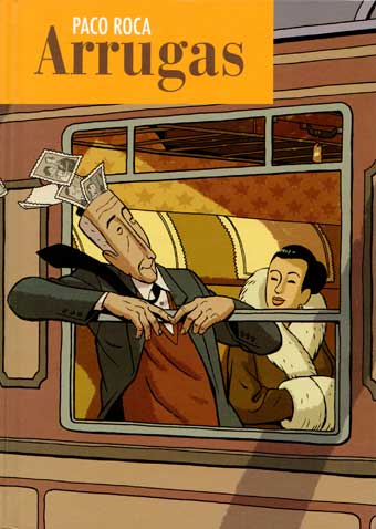
One of the comics I picked up in Barcelona last month was Arrugas by Paco Roca, a story about an old man’s encounter with Alzheimer’s Disease. I don’t read Spanish, but visually “reading” it panel to panel at the airport still provided a coherent and sometimes moving experience. Here’s a scan of some early pages to give you a sense of the storytelling. Looking forward to seeing an English edition, it’s clearly a good book.

When I worked at DC Comics in the production department in 1982 (my first job out of college), I spent many lunch hours flipping through the huge collection of untranslated manga at the nearby Kinokuniya, Manhattan’s largest Japanese bookstore. I admired how many could be understood on the strength of their visual storytelling alone. It was refreshing to experience that again.

I met or was introduced to the work of a number of talented artists in Barcelona (many through Astiberri) including Alberto Vazquez, Fermin Solis, David Rubin, Felix Diaz and Tony Sandoval. Most haunting, though, might have been the album I found by French artist Ivan Brun called No Comment, a silent, funny and extremely dark look at modern society.

Writing with pictures (or screaming with pictures, in Brun’s case) in the language of comics.


Yeah, That’s About Right

Patrick Farley makes it visible.


Karasik and Giotto and Comics

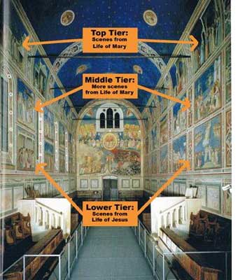
Paul Karasik offers his take on Giotto’s 600 year-old strip-style storytelling on display at the Scrovegni Chapel in Padua.

Is it “comics”?

I like to use the word at times like this because I think it encourages us to find patterns throughout art history that can inform new work today, but there are plenty of people who insist on other criteria like mechanical reproduction or direct cultural links, so take my use of the word with a grain of salt.

The definitions debate came up in the Inkstuds interviews I linked to on Saturday. Check out my own discussion with Robin from 20:15 to 23:16 for one of the most candid responses I’ve given yet on the subject.


Pixxicato

Can’t. Stop. Playing.

[link via our friend Alice]


Iconic Identification Examined

Neil Cohn sends news of a Korean neuroscience study testing the iconic identification theory from Understanding Comics Chapter Two. (Does everyone get emails like this or is it just me?). Peculiar but interesting reading.

Meanwhile, a bit closer to my old stomping grounds in Medford, Massachusetts, Neil himself has been hard at work with theories, essays, and studies of his own for some time, all of which can be found at his extensive site. He’s even posted a reaction to the Korean study here.


I Will Beat this Horse Again and Again until it RISES FROM THE DEAD

What’s the default shape of our art forms?

Cinema is wider than it is tall. TV is wider than it is tall. Theater is wider than it is tall. Laptop and desktop monitors are wider than they are tall. In fact, with the advent of widescreen TVs, there’s little difference in the shapes. They’re all around 3×5 or 4×5 range. Wider than tall. All of them.

And print? Well, print is taller than it is wide right? The printed page is the exception to the rule, isn’t it?

Wrong.

The default shape of print is not taller than wide. It’s wider than tall just like all the rest, because the default shape of print is two pages side-by-side. And the reason is the same reason as the shape of TV and cinema and theater and surfing and all the rest: because we have two eyes next to each other, not one on top of the other.

I don’t even have a Kindle yet, so this isn’t meant as a specific critique of the device. And I’m sure its engineers had solid practical reasons to design the device the way they did. You can even turn it sideways when needed.  It just reminded me when I went to Amazon this morning and saw images of the latest, how design principles in the wild can always be adjusted on the fly, but as soon as they’re embedded in hardware, they tend to stick around. For decades in some cases.

So if I could humbly suggest a new cardinal rule of designing anything meant to be read (including webcomics): Step #1, look in a mirror.

[Edit to add: Within ten minutes of posting, everybody has agreed that I’m utterly wrong about this! Oh well. Check the comments thread to see some smart, funny rebuttals.]